FIFTY FIFTY opens a new world.
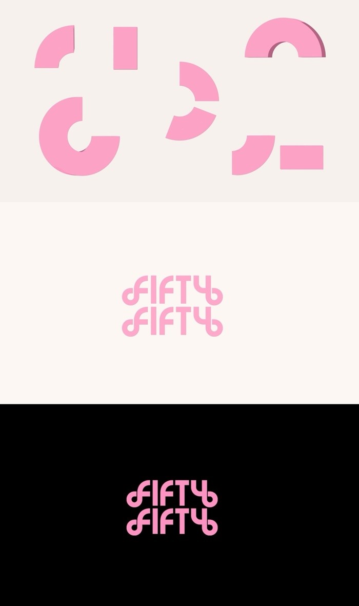
On the 5th, ATTRAKT unveiled FIFTY FIFTY's new logo motion. They announced the change in the logo. It hinted at the team's new identity, color, and story.
They gave a 180-degree variation. Unlike the previous official logo, which was a bold black and white linear shape, the new logo features geometric elements like pinkish colors and patterns.
The logo motion boasted a stylish presentation. Various shapes spun uniquely from a round circle and reconnected into one after several rearrangements.
A representative said, "It represents the reborn FIFTY FIFTY, showcasing how the scattered times from past events have come together again. It expresses the group's color and identity."
Before FIFTY FIFTY's comeback, ATTRAKT plans to sequentially reveal various content. Prior, they released a silhouette video teaser, attracting fans' attention.
<Photo courtesy of ATTRAKT>